Circle Day 2024: Building Inclusive Web Experiences
What is Circle Day?
Circle Day is an annual event hosted by Squarespace that brings together designers, developers, and creative professionals to explore, learn, and grow in the digital space. This year, Circle Day 2024 gathered a diverse community of passionate individuals to share insights and celebrate creativity. As a Squarespace Circle Programme Partner for the Nordics, I had the honour of being invited to speak at this incredible event.
Building Inclusive Web Experiences
During Circle Day 2024, I presented on the topic “Building Inclusive Web Experiences.” My goal was to share insights and practical strategies for creating websites that are accessible, engaging, and seamless for all users. As a partner at Inclusive Creation, an IT consultancy focused on inclusive workplaces, products, and services, and a Circle Partner for Squarespace, this work reflects our commitment to crafting purposeful and impactful digital experiences.
What I Have Learned on My Journey
Throughout my journey, I’ve had the privilege of working with a wide range of clients, including motivational speakers, philanthropists, and companies across various sectors. These experiences have taught me a few key lessons.
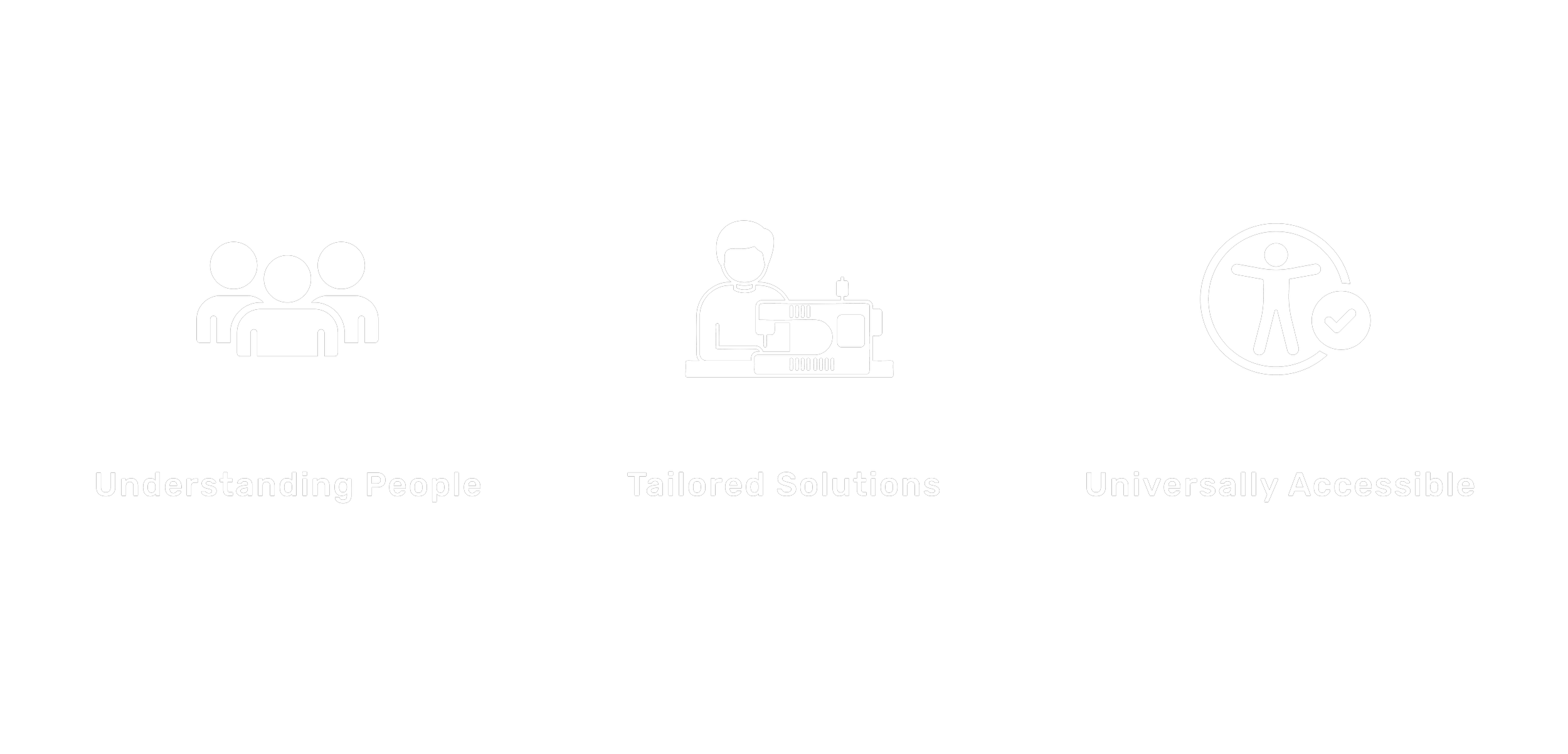
Understanding People Beyond Technology – Successful digital design is about more than just mastering tools and technologies. It’s about truly understanding people—their needs, preferences, and goals. By building relationships with clients and listening to their vision, we create designs that resonate.
Tailored Solutions for Unique Visions – Every project is different, and a one-size-fits-all approach doesn’t work in digital design. Creating tailored solutions that align perfectly with a client’s brand identity ensures that the digital experience is both authentic and impactful.
Balancing Personalization with Universal Accessibility – The craft of designing web experiences is about making each space both deeply personal and universally accessible. By focusing on the needs of individual clients while adhering to the principles of inclusive design, we create digital spaces that are functional, meaningful, and accessible to all users.
Why Inclusive Design Matters
Inclusive design is about more than meeting accessibility standards—it’s about creating thoughtful, intentional web experiences that work for everyone. Here are the three main reasons why inclusive design is essential:
Business Advantage – Inclusive design expands your audience reach, making your products and services accessible to a broader customer base, which ultimately leads to growth and increased revenue.
Legal Responsibility – Many countries require accessibility by law, making it crucial to comply with regulations to avoid legal consequences and to ensure digital spaces are accessible to everyone.
Moral Responsibility – Inclusive design ensures that everyone, regardless of ability, has equal access to information and services. It’s the right thing to do and fosters a more equitable society.Practical Strategies for Building Inclusive Web Experiences
Foundational Aspects
In my presentation, I covered several foundational and advanced aspects of inclusive design:
Structured Headings
Well-structured headings are crucial for screen readers, allowing visually impaired users to navigate easily. This also improves SEO by signaling the content hierarchy to search engines.
Colour Contrast
High-contrast color schemes make text readable for users with visual impairments, including color blindness. Squarespace provides tools to adjust color settings to meet recommended contrast ratios.
Alt Text for Images
Alt text makes images accessible to visually impaired users and boosts SEO. In Squarespace, adding alt text is simple—just click “Edit” on an image block and fill in the “Alt Text” field.
Example
“Building”
It's vague, has no context.
“A yellow and white traditional-style building with ornate window frames and balconies, set against a clear blue sky."
It’s clear, descriptive, and accessible.
Font Size and Type
Choosing the right font size and type enhances readability, particularly for users with visual impairments or dyslexia. Squarespace’s Style Editor lets you adjust font sizes and types across the entire website to ensure readability.
Example
Not the Best Call.
A Solid Choice.
Forms and Navigation
Accessible forms and intuitive navigation are key to a user-friendly experience. Squarespace’s built-in form blocks and drag-and-drop navigation editor help ensure that all users can interact with the site easily.
Advanced Concepts: Usability and Designing for Extreme Users
I also introduced two of my favourite concepts in inclusive design:
Usability
A usable website is effective, efficient, and satisfying. It means users can complete their goals easily, quickly, and enjoyably.
For example, optimizing the search functionality in Squarespace allows users to find content more effectively, while streamlining the checkout process makes it efficient.
Designing for Extreme Users
The “Average User” is a Myth – it doesn’t exist. By designing for extreme users — those with the most specific needs – we make the experience better for everyone. Examples include using descriptive link text, like “Explore our Guide on accessibility best practices,” instead of vague phrases like “Click here,” and ensuring button labels are consistent across the website.
Key Takeaway
Inclusive design isn’t just about meeting accessibility standards—it’s about creating thoughtful, effective web experiences that work for everyone. By leveraging Squarespace’s powerful tools with an inclusive mindset, we can create websites that are not only beautiful and functional but also accessible and barrier-free.
Final Thoughts
I’m grateful to Squarespace for inviting me to speak at Circle Day 2024. It was an amazing opportunity to share ideas, connect with a passionate community, and explore how we can make the web a more inclusive space. If you’re interested in learning more or want to continue the conversation, feel free to reach out!


